Testing the Usability of Windows 3.1
Research

Overview:
This project explores the usability of Windows 3.1 through a series of user tests and evaluations. Using tools like iMotions, heuristic evaluations, and paper prototypes, I analyzed how interface design has evolved and how users interact with legacy systems. The project highlights key usability challenges and insights that inform how modern interfaces can better support efficiency and accessibility.
iMotions
Tools Used:
Windows 3.1 Emulator
Research Goals:
Can they navigate the Windows 3.1 interface with minimal struggle?
What usability barriers exist within this legacy system?
Can users create and save a text document (“address.txt”) to the C: drive?
Methods:
-
Heuristic Evaluation
-
Paper Prototype Test
-
iMotions Test

Heuristic Evaluation:
The heuristic evaluation focused on identifying design flaws that break core usability principles. I found that the File Manager was cluttered, icons were overly detailed and inconsistent, and there was little visual hierarchy. The minimize and maximize arrows were particularly confusing, causing unnecessary friction during navigation.
_edited.jpg)
Key takeaway:
The interface lacks intuitive visual feedback and hierarchy, which makes even simple tasks feel complex.
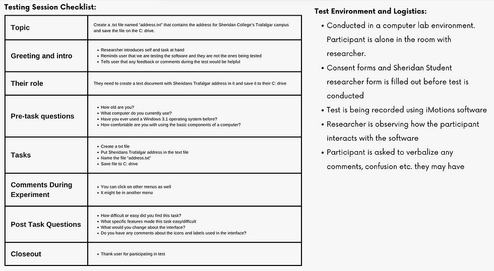
Paper Prototypes:
Using hand-drawn screens, participants were asked to create a text file containing Sheridan’s Trafalgar address and save it as address.txt on the C: drive.
Pre-Test Planning:
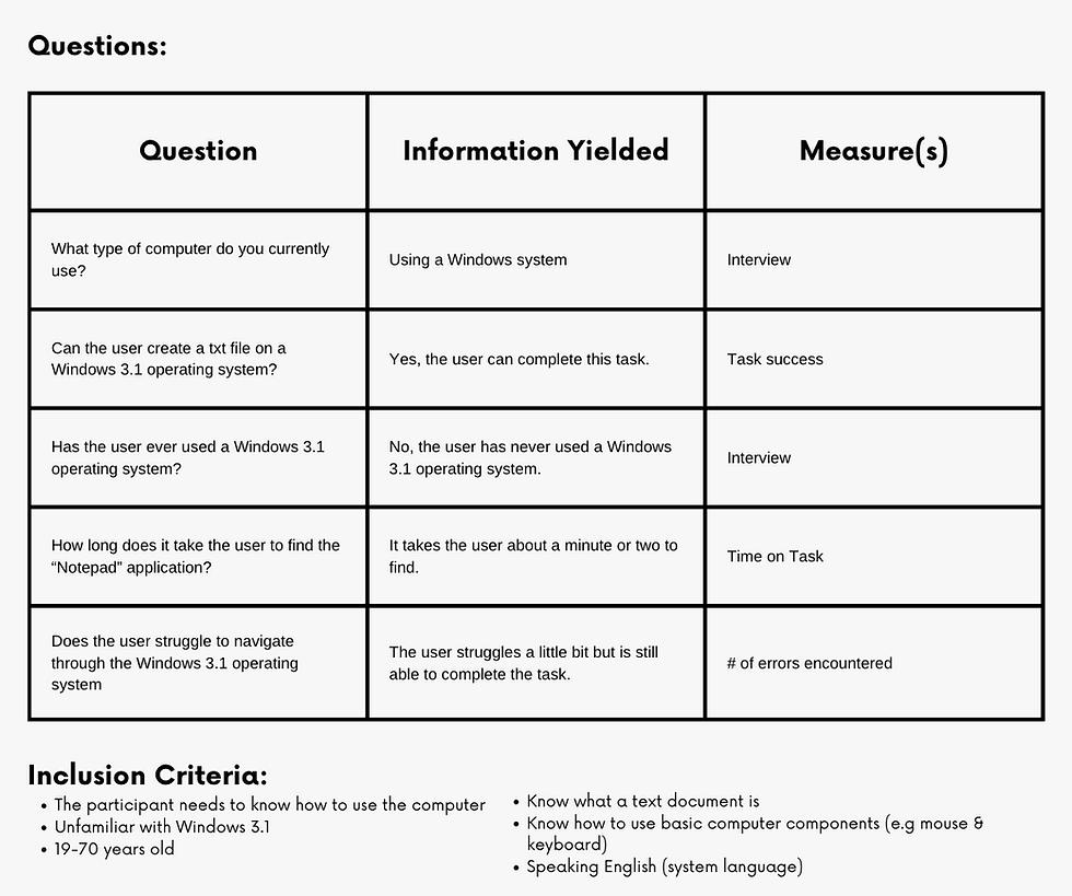
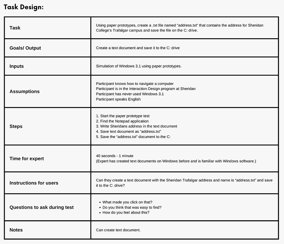

Paper Prototypes:
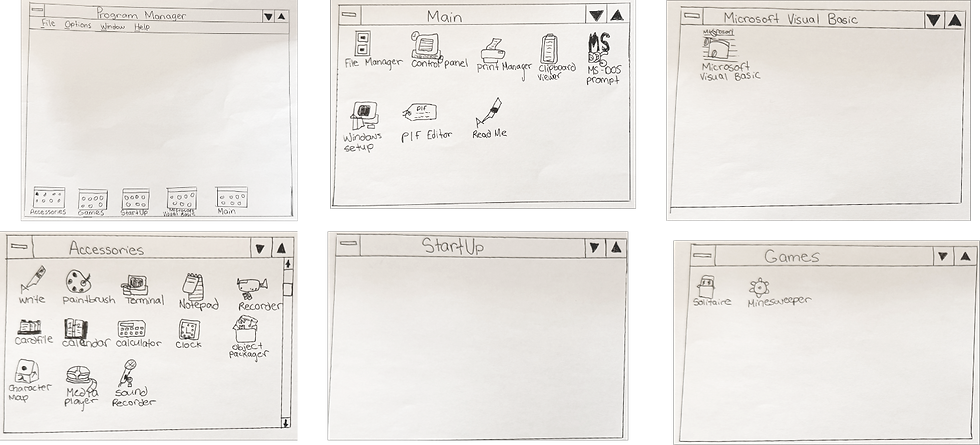_edited_edited.png)
_edited.png)
Insights:
Even in a simplified prototype, users found Windows 3.1’s icon system unintuitive, showing that design clarity outweighs nostalgia.
iMotions Test:
The iMotions test used eye tracking software to observe users performing the same task on a Windows 3.1 emulator.
Pre-Test Planning:


Results:

Observations:
-
Users hesitated when minimizing/maximizing windows.
-
Many took longer to find Notepad compared to modern systems.
-
Eye-tracking revealed confusion around icons and folder layout.
Insight:
Eye-tracking exposed cognitive friction invisible in heuristics alone, proving how valuable mixed method testing is for usability research.
Insight:
Eye-tracking exposed cognitive friction invisible in heuristics alone, proving how valuable mixed method testing is for usability research.
This project showed how different research methods complement each other in uncovering usability problems. The heuristic evaluation revealed structural flaws, while the iMotions test showed real user struggles in context.
The final solution addresses the following usability issues:
-
Replace confusing window arrows with standard minimize/maximize icons.
-
Add a search bar to simplify navigation.
-
Simplify and modernize iconography to improve clarity.
Final Reflection:
Before:

After: