top of page
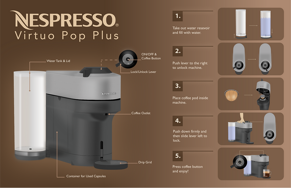
Visualizing Data With the Nespresso Virtuo Pop Plus
Visual Design


Overview:
This project visualizes the Nespresso Virtuo Pop Plus coffee machine as a branded instructional infographic. My goal was to balance clarity, usability, and visual appeal while maintaining Nespresso’s premium tone. Through research, sketching, and iteration, I developed a final design that communicates information effectively and feels cohesive with the brand’s identity.
Adobe Illustrator
Tools Used:
Target Audience:
The target audience consists of busy adults aged 25–60 who appreciate convenience, quality, and modern design. They value products that simplify daily routines while maintaining a sense of luxury and style, making the Nespresso Virtuo Pop Plus a perfect fit for their lifestyle.

Process Work:
I began by photographing each step of using the Nespresso machine, then simplified the process from twelve steps down to six clear actions. Through sketching and iteration, I explored how to visually communicate each step effectively while keeping the layout clean and easy to follow.
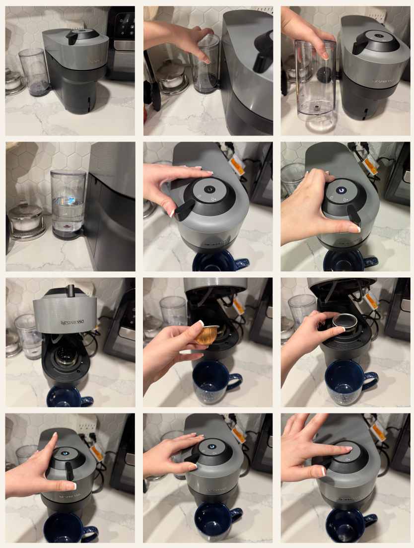


Object Drawings:
Using Adobe Illustrator, I traced the Nespresso machine with the Pen tool to capture its precise shape and details. I then experimented with shading techniques like the Object Blend and Gaussian Blur to create realistic highlights and depth, ensuring each angle of the machine looked polished and professional.


Visual Research
I created a warm, coffee-inspired colour palette using rich browns and soft neutrals to reflect Nespresso’s premium tone. For typography, I explored fonts that matched the brand’s sleek and modern identity, ultimately incorporating the official Nespresso type logo for authenticity. I also refined the linework, testing thickness and contrast to ensure clarity and balance, making each element stand out while maintaining a cohesive, elegant look.


Layout Exploration:
I explored both portrait and landscape layouts to find the best balance between labeling, imagery, and instructional flow. Early versions felt too boxed in, so after receiving feedback, I removed unnecessary borders to create a more open and cohesive design. This adjustment improved readability and gave the infographic a cleaner, more premium feel that aligned with Nespresso’s branding.


Final Design:
The final infographic brings together all aspects of the design process into a polished, brand aligned visual. The dark gradient background, realistic renderings, and refined typography create a premium look that reflects Nespresso’s identity. Clear labeling and balanced composition make the instructions easy to follow while maintaining a sense of elegance and sophistication.
bottom of page